Subscribe
to receive news by email

Poll
Will the Trump Administration Shift U.S. Policy in Favor of Palestine?
- No (87%)
- Yes (13%)
Copyright © 2026 Arab America
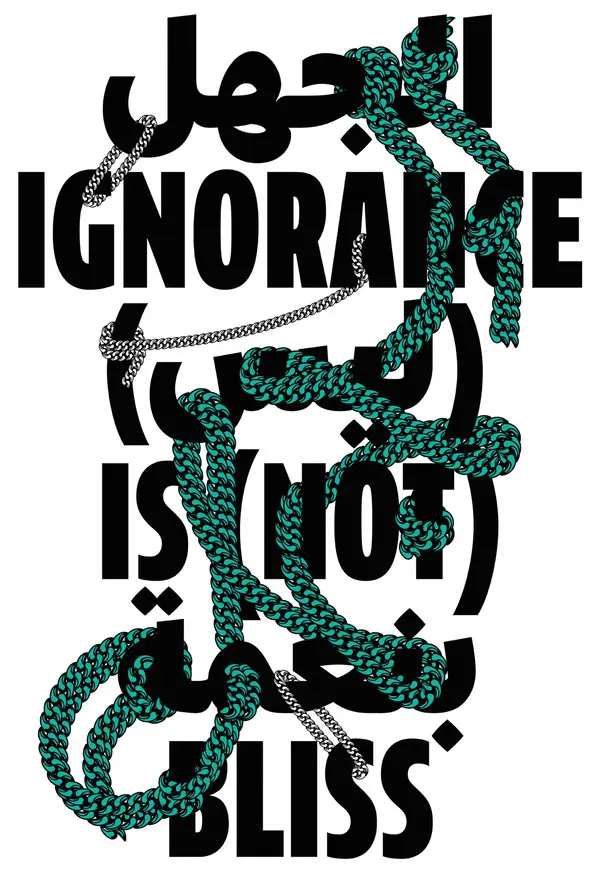
Go topThe History of Arabic Typography & How Arab Graphic Designers are Reinventing the Arabic Type Design
By: Menal Elmaliki / Arab America Contributing Writer
How the Arabic Language is Represented in West
Hollywood’s Persistence of Arab Stereotypes
From the earliest Hollywood portrayal of Arabs, The Sheik (1921), to oriental’s interpretation of the East in Aladdin (2019), where you’re not sure whether its Indian, Arab or Persian, to America’s beloved t.v series Homeland (2011-2020), a psychological thriller that focused on the Iraqi war and Al Qaeda. The miniseries, lasting for 8 seasons, was nicknamed “the most bigoted show on television,” and still won an Emmy for best drama and was supposedly Obama’s favorite pastime.
Hollywood’s obsession with Arabs has always been bad, depicting them uncivilized barbarians, religious- fanatics, towel-heads, and sheikhs as ugly and sexually deviant. Tv series and films supported these very stereotypes and promoted the idea that Arabs are scary, they are to be feared, they are not real people with real stories. The Arab- as- villain motif isn’t only getting old but is detrimental to a marginalized Arab and Muslim communities living in post 9/11 America.

Arabs Create ‘Terror’
‘Homeland is watermelon,’ ‘Homeland is racist,’ ‘Homeland is a joke, and it didn’t make us laugh,’ it was an iconic moment for Arabs as artists were hired to create Arabic artwork and graffiti a scene that took place in a refugee camp to make it appear more ‘Arabish.’ They took the initiative to express their dislike for the show through satire, writing disparaging tags that mocked its own show since the directors and producers wouldn’t know the difference. They, like many Arabs and Muslims, expressed a general dislike for the tv series and their portrayal of them and these tags were a vindication, a means of silent protest to their dehumanization and misrepresentation of their people.

One of the artists stated that to hollywood director and producers the ‘‘Arabic script is merely a supplementary visual that completes the horror-fantasy of the Middle East,” Shows and films alike promote this unconscious bias that associate Arabs and Arabic to terrorism. The poor visibility has Arabs trapped in this perpetual cycle where they can only be terrorists or refugees, to be either pitied or hated. The Middle East is more than just the image of war- torn societies, ghettos, refugee camps, broken and disheveled neighborhoods and homes, and it is more than a breathing ground for terrorism, and Arabic is more than the language of terror, it is lyrical, poetic and it is a reservation of history, peoples, and cultures.
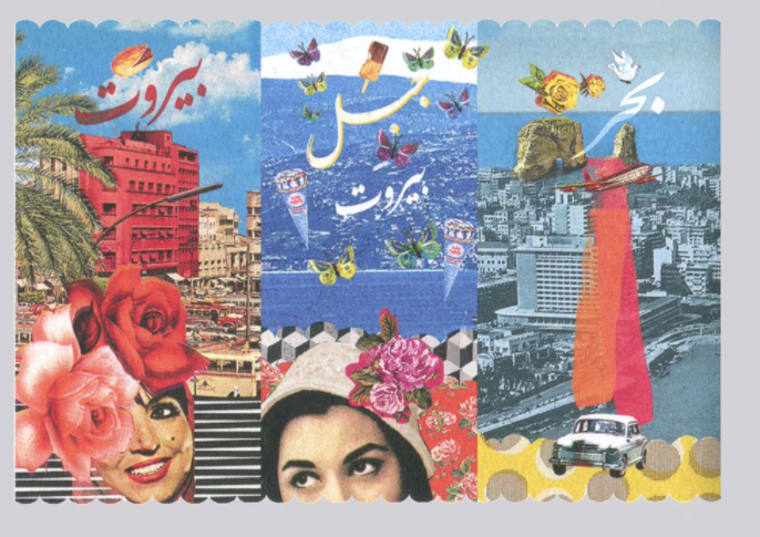
New- Gen Arab designers and artists have reinvented the language and some are calling it the renaissance of Arabic, designs ranging from Arab traditionalism to modern and cross-cultural. Reinvention is fueled by Arab passion, pride, a relentless desire to be recognized by the entire world, and a general dissatisfaction of misrepresentation.
History of Arabic Graphic Design & Typography
“there is an urgent need to write our [design] history from our perspective as Arabs, as people who were born on and lived on this land.”
Haytham Nawar (author of A History of Arab Graphic Design)
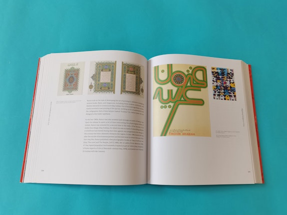
Bahia Shehab and Haytham Nawar’s A History of Arab Graphic Design, not only dispels many ill-held assumptions of art and graphic design in the Middle East but it also shows a in dept history of design in the region. The book begins with the foundation of art and design before the 1900s which was “Islamic visual language and early Arabic printing.” This was considered the foundation or the origin of graphic design and an inspiration for future Arab designers of the 20th and 21st century.
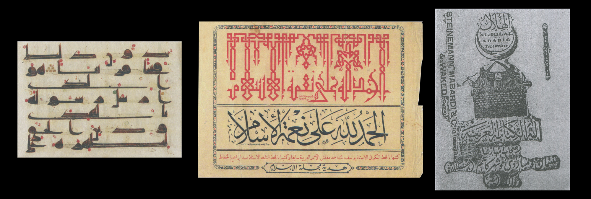
In the early 20th century, with the introduction of national print and publications such as Arab magazines, newspapers, and the introduction of Arab cinema, which quickly became popular, the Arabic typewriter was invented. The typewriter gave artists more leniency in design and by the late 1930s, at the height of Egyptian Cinema, there was a shift in Arabic typography from vernacular and traditional to more flexible, free, and modern. One of the designers at the time, Abdel Salam el Sherif was known for his modern designs working in the film industry, newspapers and publishing houses. His Arabic typography was one of a kind, differing vastly from the traditional, colloquial Arabic calligraphy design.
Between the periods of 1940- 1960, the political background of the Arab states shifted Arabic graphic design and typography, a different social and political mindset produced different images, ideas, and designs. Designers, at the time, with Arab states gaining their independence, began to “explore ways to promote the Arabic language through the Pan-Arabism of the Nasser period.” Many artists emerged from the 1950s pan-Arabism; Arab nations burgeoned creating a unity of language, religion, history, and culture that influenced artists like Sudanese graphic designer Osman Waqialla.
Much of the calligraphic abstraction which was a style that began in the 1950s was influenced by Arabic calligraphy. In the 20th century Arab art, poster design, typography was influenced by themes of identity, addressing questions like what did it mean to be Arab, themes of immigration, modernity, secularization and Islamization. Much of the people reacted through art, expressing their sentiments and confusion through harmonizing colors, lines, shapes and designs. Between the 1970s and 1980s, was a troubling time for many Arabs as they dealt with exile, civil war; many designers from Lebanon were forced into exiled and Iraqis were forced to flee because of the Iraqi gulf. The civil strifes and wars contributed to the world of Arabic design and typography.
One of the greatest pop artist of the 1970s was Armenian-Egyptian artist Chant Avedissian, he was known for his genius art. He created “visual identities for Egyptian companies” and his influence is felt in popular design in Egypt today, where a similar aesthetic can be found on coasters and phone cases.” His mixture of pop art and Arabic typography paved the way for future designs and inspired a new, younger, more modernized audience.

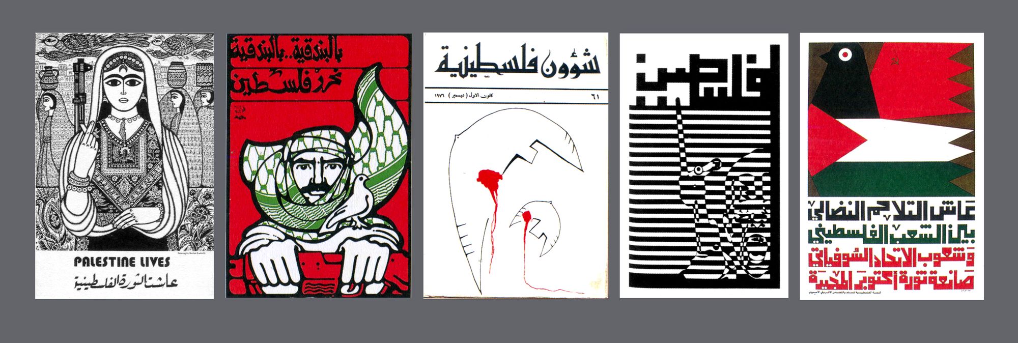
In the 20th century, between the 1980s and 1990s, there was a search for a new identity since the Arab world at the time was undertaking drastic change; facing war and division, having to deal with the aftermath of colonization, political strife, secularizations and westernization. The Palestinians were one of the most oppressed at the time, having to deal with mass explosion, land theft, and the erasure of their identity. This oppression sparked a new field of Arabic typography, the introduction of art in opposition since it became their only means of resistance towards oppression and censorship. Many Palestinians created new form of art in response to their contemporary social and political realities, hoping people can feel their pain and suffering. Also, designers such as Sudanese artist Hasan Musa’s art was inspired by cultural and global events. From the reigns of traditionalism transpired a new design of Arabic typography- a blend of modernity and nostalgia.
Throughout the century, graphic designs and typography has changed drastically as Arab artists dealt with adversarial factors and challenges, they were having difficulty adapting Arabic to Western technologies because it was specifically developed for Latin script. Thus Arabic typography was staunched, haven’t changed much due to its subjugation to western printing techniques. According to Bil’ak, who is the founder of founder of Dutch type foundry Typotheque, although the Arabic typewriter was invented, it kept the design simplified and it did not fully accommodate the intricacies and the number of glyphs. There was a strong elitist and discriminatory attitude that Arabs face till this day but despite challenges they managed to push through creating inventive and inspiring work born out of passion with economic, social, and political influences and influencing the next generation of artists and designers at the turn of the new century.
In more modern times, designers have broken the so called rules of “simplified Arabic,” out of conformity, they created new designs inspired by its typographic history, as well as their region’s modern culture, heritage, and identity. Modern designs reflect the complexity and beauty of Arabic while also keeping to traditionalism. Atlas, the 21st century, between 1990- and 2000, marked the “rebirth” of Arab design and typography with the popularity and reintroduction of pop art.
Modern Arabic Designs & Typographies
Contemporary designers such as Zeid Jaouni emphasized the beauty of the Arabic language and many artists like her acknowledge the challenge of modernizing the Arabic script. She states, “I hope the Arabic visual culture will be exposed more worldwide to receive the appreciation it deserves. The Arabic language has a beautiful form that can be incorporated in many ways. It is flexible but limited at the same time, and this makes it an interesting challenge to work with.”

Saudi artist Noha Raheem, combines the typography of both Arabic and Japanese to create a design that combines the unique culture of two civilizations. The two language offer distinct styles and when combined creates something new. She states that when she as younger, “she discovered the three famous Japanese written scripts — including Kanji, Katakana and Hiragana — and she was awestruck.” She defies the conventional Arabic type norms to create unconventional designs that test the Arabic type norm, exploring the beauty and flexibility of the Arabic language. Noha wishes other Arab artists can see eye to eye and also explore the flexibility of the Arabic language.

Graphic designer Kinda Ghannoum, Syrian-born, draws inspiration from Arab architecture and history, utilizing geometric motifs, patterns, ornaments, and manuscripts when creating new designs. She emphasized the beauty of culture, “it’s beautiful to have the ability to highlight our culture all over the world due to the great value it has.”

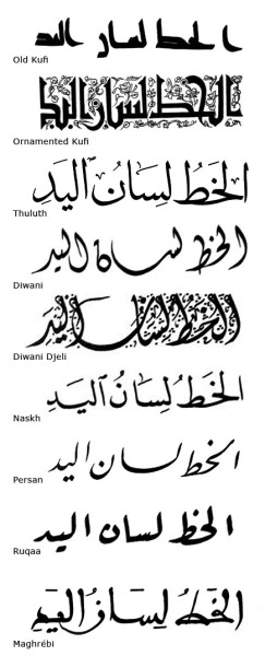
Other artists such as Rana Wassef also challenge the limits of Arabic typography and draws the connection between identity and art, stating, “the MENA region, especially Cairo where I come from, is heavenly packed with a strong Arabic identity.” She began to show an interest in Arabic typography while walking around Cairo. Rana was greatly influenced by the many aspects of the Cairo Scene where she saw identity in many forms, to the way people communicated, to style of music, as well as old and new signage and prints. She goes on to say that she wishes for Arab type to remain steadfast in its Arab identity and to not limit your challenges to the traditional Nashk calligraphy style to try and think outside the box.


Check out Arab America’s blog here!